






Black and white linework is only half the story. You’ve seen it: a comic page where the inks are beautiful but the colors are muddy, flat, or fighting the art — and a page where the coloring is so good it elevates average linework into something you can’t stop looking at. Color is half the storytelling in comics. Let’s learn to do it right.
Digital comic coloring is one of the most learnable professional art skills: the process is structured, the tools are affordable, and the industry always needs colorists. Here’s the beginner’s playbook.
What a Comic Colorist Actually Does
A colorist doesn’t just “fill in” the line art. They control mood, time of day, focus, and emotion — they’re basically the lighting director and cinematographer of the comic. The same inked page colored for a horror scene versus a romantic scene tells two completely different stories.
The standard workflow has four stages, and professionals do them in order:
- Flats — flat base colors for every area. No shading yet. Think of it as a coloring book, done cleanly.
- Rendering — shadows, highlights, and light sources. This is where the page gets depth.
- Effects — glows, atmosphere, speed lines, special touches.
- Polish — color holds (colored line art), final adjustments, consistency across pages.
Beginners try to do all four at once and get mud. Do them in order and each stage is manageable.
Your Digital Coloring Station
You need less than you think:
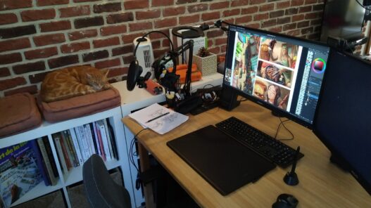
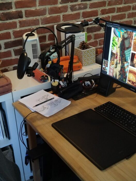
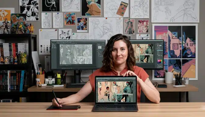
- Software: Clip Studio Paint (the comic industry standard), Photoshop, or the free Krita. All handle layers, which is the one non-negotiable feature.
- A drawing tablet: this is the one place a tablet genuinely matters — pressure sensitivity controls your brush opacity, which controls everything. Even a basic pen tablet transforms the work.
- Reference: a folder of comic pages whose coloring you admire. Study them zoomed in. How many colors did they actually use? (Fewer than you think.)
Set your canvas to at least 300 DPI at print size. Coloring at low resolution and upscaling later is the most common technical mistake beginners make — and it’s unfixable after the fact.
Flats: The Boring Step That Matters Most
Flatting is filling each area with its base color on a separate layer beneath the line art. It’s tedious, and professionals often outsource it, which tells you something: it’s foundational, not glamorous.
Rules for good flats:
- Keep each major element on its own layer or use layer masks — skin, hair, clothing, background. Future-you will thank present-you when the art director says “make the jacket red instead.”
- No gaps. Zoom in and close the tiny white holes along the line art, or they’ll glow like neon when you add shading.
- Choose your palette deliberately. A page should have a dominant color family (a “color script”) that matches the scene’s mood — warm ambers for nostalgia, cold blues for isolation, sickly greens for dread.
Rendering: Where Light Becomes Story
Shadows are where beginners reveal themselves. The rules are simple but non-negotiable:
- One light source per scene. Decide where the light comes from and shade everything accordingly. Inconsistent lighting is the fastest way to make a page look amateur.
- Shadow shapes, not gradients. Comic coloring uses defined shadow shapes (cel shading) more than soft blends. Pick the shadow shape deliberately — it should describe the form, not just darken it.
- Warm light, cool shadows (usually). This classic pairing creates natural-looking depth. Sunlight is warm; the shadows it casts are cool. Reverse it for moonlight.
- Rim light for drama. A thin bright edge on the shadow side of a character separates them from the background and screams “cinematic.” Use sparingly — it’s strong seasoning.
Study how light wraps around a sphere, then a face, then a full figure. Master the sphere and everything else is an application.
Color Holds and Special Effects
Once the basics work, these are the techniques that make pages look professional:
- Color holds: coloring the line art itself instead of leaving it black. Warm brown lines for a sunset scene, blue lines for night — it unifies the page instantly.
- Atmospheric perspective: background elements get cooler, lighter, and less saturated with distance. Two background layers with different treatments create instant depth.
- Selective detail: render the focal character fully, keep the background looser. The reader’s eye goes where the detail is — control it deliberately.
Your First Project: Color Three Pages
Find free practice line art (many artists share “color me” pages, or ink your own sketches). Color the same page three times: once as a bright daytime adventure scene, once as a tense night scene, once as a dream sequence. Same lines, three moods. This single exercise teaches more about color storytelling than any tutorial.
If your drawing fundamentals need work first, pair this with structured learning — starting a creative skill as an adult covers how to build the habit, and a color-focused course will sharpen the instincts that digital coloring depends on.
Breaking Into the Industry
Comic coloring is a real freelance market: indie comics, webtoons, and publishers hire colorists per page. Rates vary wildly, but the path is clear — build a portfolio of 10–15 strong colored pages, share process breakdowns (flats → render → final) because art directors love seeing your thinking, and start with indie anthologies and webcomics. Many working colorists are self-taught; the portfolio is the credential.
Frequently Asked Questions
How long does it take to color a page?
Professionals average 4–8 hours per page depending on complexity. Beginners should expect double that — speed comes with the workflow, not with rushing.
Should I learn to ink too?
It helps enormously to understand what the inker intended, but plenty of colorists only color. If you can draw a little, you’ll communicate with inkers better — that’s the real benefit.
Building Speed Without Losing Quality
Professional colorists are fast — not because they rush, but because their workflow eliminates wasted effort. Speed is a system, not a talent. Here’s how to build it:
- Keyboard shortcuts for everything. Brush size, eyedropper, undo, layer switching — every second spent hunting through menus is a second not coloring. Learn five shortcuts a week until the common ones are muscle memory.
- Actions and batch steps. Setting up canvases, creating flat layers, applying standard adjustments — automate the repetitive setup once, save hours forever.
- Separate passes, no backtracking. Finish all flats before any rendering. Finish all rendering before effects. Jumping between stages feels productive and destroys flow — discipline here is pure speed.
- Reference sheets, not memory. Keep your palette, light direction notes, and character color guides visible while you work. Looking things up is faster than repainting mistakes.
- Time yourself. Not to stress — to measure. Knowing a page takes you six hours lets you price freelance work, plan schedules, and watch yourself genuinely improve month over month.
The paradox: slowing down on flats and planning makes the whole page faster. Most “slow” colorists are actually fast colorists who keep redoing things because they skipped the boring setup.
Flats vs. rendering — which should I practice more?
Rendering gets the glory, but flats are the bottleneck. Clean, well-organized flats make rendering twice as fast; sloppy flats make it miserable. If you want one practice priority, it’s this: flat faster and cleaner. Everything downstream gets easier.
The Half Becomes Whole
Linework is the skeleton; color is the skin, the light, the weather, the mood. Learn to color and every drawing you touch gets twice as powerful. The black-and-white page was never the finished story — it was waiting for you to unleash the color.