








Here’s a uncomfortable truth about logos: most bad ones weren’t made by untalented people. They were made by people who skipped the thinking and went straight to the computer. They opened a design program, typed the business name in a fancy font, added a clip-art swoosh, and called it a brand.
A memorable logo is the opposite of that. It’s the result of research, dozens of sketches, ruthless editing, and testing. The good news? That process can be learned. Here’s how to design an original logo from scratch — the way professionals actually do it.
What a Logo Really Is
A logo isn’t just a pretty mark. It’s the visual shorthand for everything a business stands for. Think of the world’s most recognizable logos — most are remarkably simple. Simplicity isn’t laziness; it’s the hardest thing to achieve, because every element has to earn its place.
A strong logo is:
- Simple — recognizable at a glance, even at tiny sizes
- Memorable — distinct enough to stick in someone’s mind
- Versatile — works in one color, reversed, tiny, huge
- Timeless — not chained to this year’s design trends
- Appropriate — fits the personality of the business
Notice “beautiful” isn’t on the list. A logo’s job is communication, not decoration.
The Professional Logo Process, Step by Step
Step 1: Research before you sketch
Every good logo starts with questions. What does the business do? Who are its customers? What do competitors’ logos look like — and how can this one be different? What three words should the brand feel like?
This phase feels slow, but it prevents the most common amateur mistake: designing something attractive that says nothing about the business. Spend at least as long researching as you do designing.
Step 2: Sketch on paper first
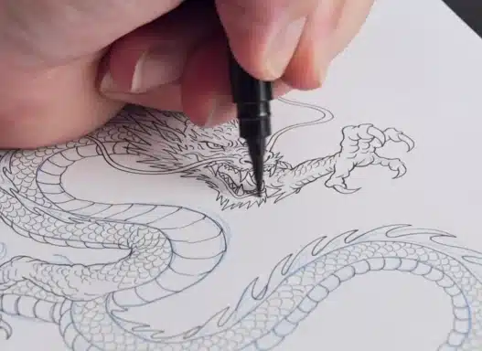
Yes, paper. A pencil and a stack of cheap paper will generate more ideas in an hour than a design program will in a day, because sketching is fast and judgment-free. Aim for quantity: 50–100 rough thumbnails. Most will be terrible. That’s the point — you’re panning for the few that aren’t.
Step 3: Develop 3–5 strong concepts
Pick your best sketches and rebuild them digitally. This is where vector software like Illustrator earns its keep — clean, scalable paths. Don’t polish yet; develop each concept just enough to judge it fairly.
Step 4: Refine ruthlessly
Choose the strongest one or two concepts and refine: adjust spacing, balance the composition, test at different sizes. Print it small — if it doesn’t read at the size of a postage stamp, simplify further.
Step 5: Test in the real world
Mock it up: on a business card, a sign, a social media avatar, embroidered on a shirt. A logo lives in context, and context reveals problems — details that vanish at small sizes, colors that clash with photography, shapes that read wrong when reversed.
Step 6: Deliver properly
A professional delivery includes the logo in multiple formats (vector files for print, PNGs for digital), color variations (full color, black, white/reversed), and basic usage guidelines. This is what separates a hobbyist from someone clients recommend.
Learning Logo Design Online
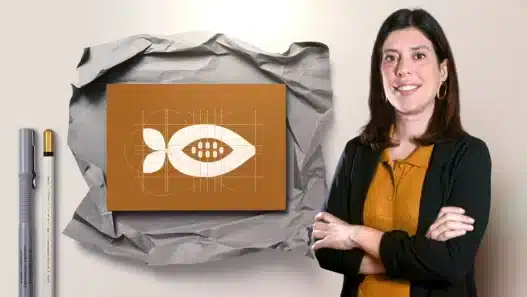
Logo design courses on online course platforms typically teach this full process, not just software tricks. When evaluating courses, look for:
- A real client-style brief. Courses built around realistic projects teach you to design within constraints — which is the actual job.
- Critique and iteration. The best courses show work being revised, not just finished. Watching a professional kill their darlings teaches more than watching them succeed on the first try.
- Typography instruction. A huge percentage of logos are type-based. If a course skimps on type, it’s incomplete.
- Portfolio guidance. Your course project should become a portfolio piece, presented as a case study with your process shown.
Presenting your work well matters enormously — our guide to building a portfolio while you learn shows how to turn class projects into client-winning case studies.
Common Beginner Mistakes
Designing for yourself instead of the client. Your taste matters, but the logo serves the business and its audience. A skate shop and a law firm need different logos even if you personally love minimal Swiss design.
Following trends. Gradient mesh logos, ultra-thin line icons, brutalist type — trends date fast. A logo should still work in ten years. When in doubt, simplify.
Too many ideas in one mark. Beginners try to say everything: the company’s history, its values, its product line. Pick one strong idea. The best logos communicate one thing clearly.
Stealing “inspiration” too literally. Looking at other logos for ideas is normal. Producing something a client could confuse with a competitor is a liability — and occasionally a lawsuit.
Skipping the black-and-white test. If your logo depends on color or gradients to work, the underlying shape is weak. Great logos work in pure black first.
Tools You’ll Need
Vector software is non-negotiable for professional logo work — Adobe Illustrator is the standard, with free alternatives like Inkscape covering the same fundamentals. Beyond that: a sketchbook, a printer for size tests, and mockup templates (many free ones exist) for presenting concepts.
You don’t need expensive gear. Some of the best logo designers in the world do their core thinking with a 50-cent pen.
Turning the Skill Into Work
Logo design is one of the most freelance-friendly creative skills. Small businesses constantly need logos, and they hire based on portfolio, not credentials. Start with:
- Redesigning fictional brands to build portfolio pieces
- Offering affordable work to local businesses and nonprofits
- Documenting your process — clients hire designers whose thinking they trust
As you grow, learning to pitch your work to brands and developing your personal brand as a designer will matter as much as the design skill itself. Clients don’t just buy logos; they buy confidence that you’ll solve their problem.
Frequently Asked Questions
How long does it take to learn logo design?
The software basics take a few weeks; the design thinking takes months of practice. Most people can produce solid portfolio pieces within 4–6 months of consistent work. Developing a truly refined eye takes years — but you can earn while you’re developing it.
Do I need to be good at drawing?
It helps, but it’s not required. Most logos are built from geometric shapes and type, not freehand illustration. What’s essential is an eye for composition, spacing, and simplicity — all trainable.
How much should I charge for a logo as a beginner?
Beginners typically start in the low hundreds for small businesses and raise rates as their portfolio grows. Never work for “exposure” alone, but early discounted projects in exchange for testimonials and portfolio pieces are a reasonable trade.
Can I use templates or AI logo makers?
For learning, no — they teach you nothing. For client work, delivering a template-based logo as original work is dishonest and risks trademark conflicts. The whole value of a designer is originality.
What’s the difference between a logo and a brand identity?
A logo is one mark. A brand identity is the full system: logo variations, colors, typography, patterns, and usage rules. Clients increasingly want the system, and it commands much higher fees — which is why good courses teach identity design, not just logo drawing.